11 Aug 2022
Are you looking for better training data for your models? Let me tell you about dynamic adversarial data collection!
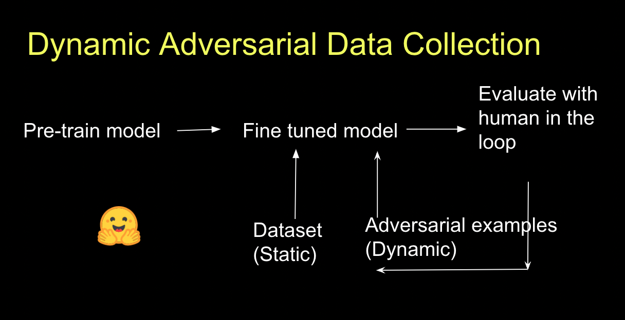
I had a large enterprise customer asking me to incorporate this workflow into a Hugging Face private hub demo. Here are some resources I found useful:
Chris Emezue put together a blog post: “How to train your model dynamically using adversarial data” and a real-life example using MNIST using Spaces.
If you want an academic paper that details this process, check out:
Analyzing Dynamic Adversarial Training Data in the Limit. By using this approach, this paper found models made 26% fewer errors on the expert-curated test set.
And if you prefer a video — check out my Tik Tok:
https://www.tiktok.com/@rajistics/video/7123667796453592366?is_from_webapp=1&sender_device=pc&web_id=7106277315414181422
15 Aug 2019
Stand Up for Best Practices:
Misuse of Deep Learning in Nature’s Earthquake Aftershock Paper
 Source: Yuriy Guts selection from Shutterstock
The Dangers of Machine Learning Hype
Practitioners of AI, machine learning, predictive modeling, and data science have grown enormously over the last few years. What was once a niche field defined by its blend of knowledge is becoming a rapidly growing profession. As the excitement around AI continues to grow, the new wave of ML augmentation, automation, and GUI tools will lead to even more growth in the number of people trying to build predictive models.
But here’s the rub: While it becomes easier to use the tools of predictive modeling, predictive modeling knowledge is not yet a widespread commodity. Errors can be counterintuitive and subtle, and they can easily lead you to the wrong conclusions if you’re not careful.
I’m a data scientist who works with dozens of expert data science teams for a living. In my day job, I see these teams striving to build high-quality models. The best teams work together to review their models to detect problems. There are many hard-to-detect-ways that lead to problematic models (say, by allowing target leakage into their training data).
Identifying issues is not fun. This requires admitting that exciting results are “too good to be true” or that their methods were not the right approach. In other words, it’s less about the sexy data science hype that gets headlines and more about a rigorous scientific discipline.
Bad Methods Create Bad Results
Almost a year ago, I read an article in Nature that claimed unprecedented accuracy in predicting earthquake aftershocks by using deep learning. Reading the article, my internal radar became deeply suspicious of their results. Their methods simply didn’t carry many of the hallmarks of careful predicting modeling.
I started to dig deeper. In the meantime, this article blew up and became widely recognized! It was even included in the release notes for Tensorflow as an example of what deep learning could do. However, in my digging, I found major flaws in the paper. Namely, data leakage which leads to unrealistic accuracy scores and a lack of attention to model selection (you don’t build a 6 layer neural network when a simpler model provides the same level of accuracy).
 The testing dataset had a much higher AUC than the training set . . . this is not normal
To my earlier point: these are subtle, but incredibly basic predictive modeling errors that can invalidate the entire results of an experiment. Data scientists are trained to recognize and avoid these issues in their work. I assumed that this was simply overlooked by the author, so I contacted her and let her know so that she could improve her analysis. Although we had previously communicated, she did not respond to my email over concerns with the paper.
Falling On Deaf Ears
So, what was I to do? My coworkers told me to just tweet it and let it go, but I wanted to stand up for good modeling practices. I thought reason and best practices would prevail, so I started a 6-month process of writing up my results and shared them with Nature.
Upon sharing my results, I received a note from Nature in January 2019 that despite serious concerns about data leakage and model selection that invalidate their experiment, they saw no need to correct the errors, because “Devries et al. are concerned primarily with using machine learning as [a] tool to extract insight into the natural world, and not with details of the algorithm design”. The authors provided a much harsher response.
You can read the entire exchange on my github.
It’s not enough to say that I was disappointed. This was a major paper (it’s Nature!) that bought into AI hype and published a paper despite it using flawed methods.
Then, just this week, I ran across articles by Arnaud Mignan and Marco Broccardo on shortcomings that they found in the aftershocks article. Here are two more data scientists with expertise in earthquake analysis who also noticed flaws in the paper. I also have placed my analysis and reproducible code on github.
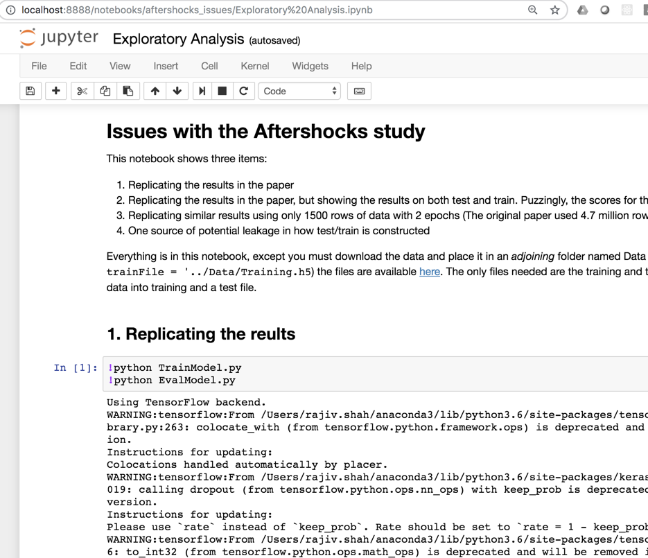 Go run the analysis yourself and see the issue
Standing Up For Predictive Modeling Methods
I want to make it clear: my goal is not to villainize the authors of the aftershocks paper. I don’t believe that they were malicious, and I think that they would argue their goal was to just show how machine learning could be applied to aftershocks. Devries is an accomplished earthquake scientist who wanted to use the latest methods for her field of study and found exciting results from it.
But here’s the problem: their insights and results were based on fundamentally flawed methods. It’s not enough to say, “This isn’t a machine learning paper, it’s an earthquake paper.” If you use predictive modeling, then the quality of your results are determined by the quality of your modeling. Your work becomes data science work, and you are on the hook for your scientific rigor.
There is a huge appetite for papers that use the latest technologies and approaches. It becomes very difficult to push back on these papers.
But if we allow papers or projects with fundamental issues to advance, it hurts all of us. It undermines the field of predictive modeling.
Please push back on bad data science. Report bad findings to papers. And if they don’t take action, go to twitter, post about it, share your results and make noise. This type of collective action worked to raise awareness of p-values and combat the epidemic of p-hacking. We need good machine learning practices if we want our field to continue to grow and maintain credibility.
Acknowledgments: I want to thank all the great data scientists at DataRobot that collaborated and supported me this past year, a few of these include: Lukas Innig, Amanda Schierz, Jett Oristaglio, Thomas Stearns, and Taylor Larkin.
This article was orignally posted on Medium and featured on Reddit
30 Jul 2018
As a data scientist, you spend a lot of your time helping to make better decisions. You build predictive models to provide improved insights. You might be predicting whether an image is a cat or dog, store sales for the next month, or the likelihood if a part will fail. In this post, I won’t help you with making better predictions, but instead how to make the best decision.
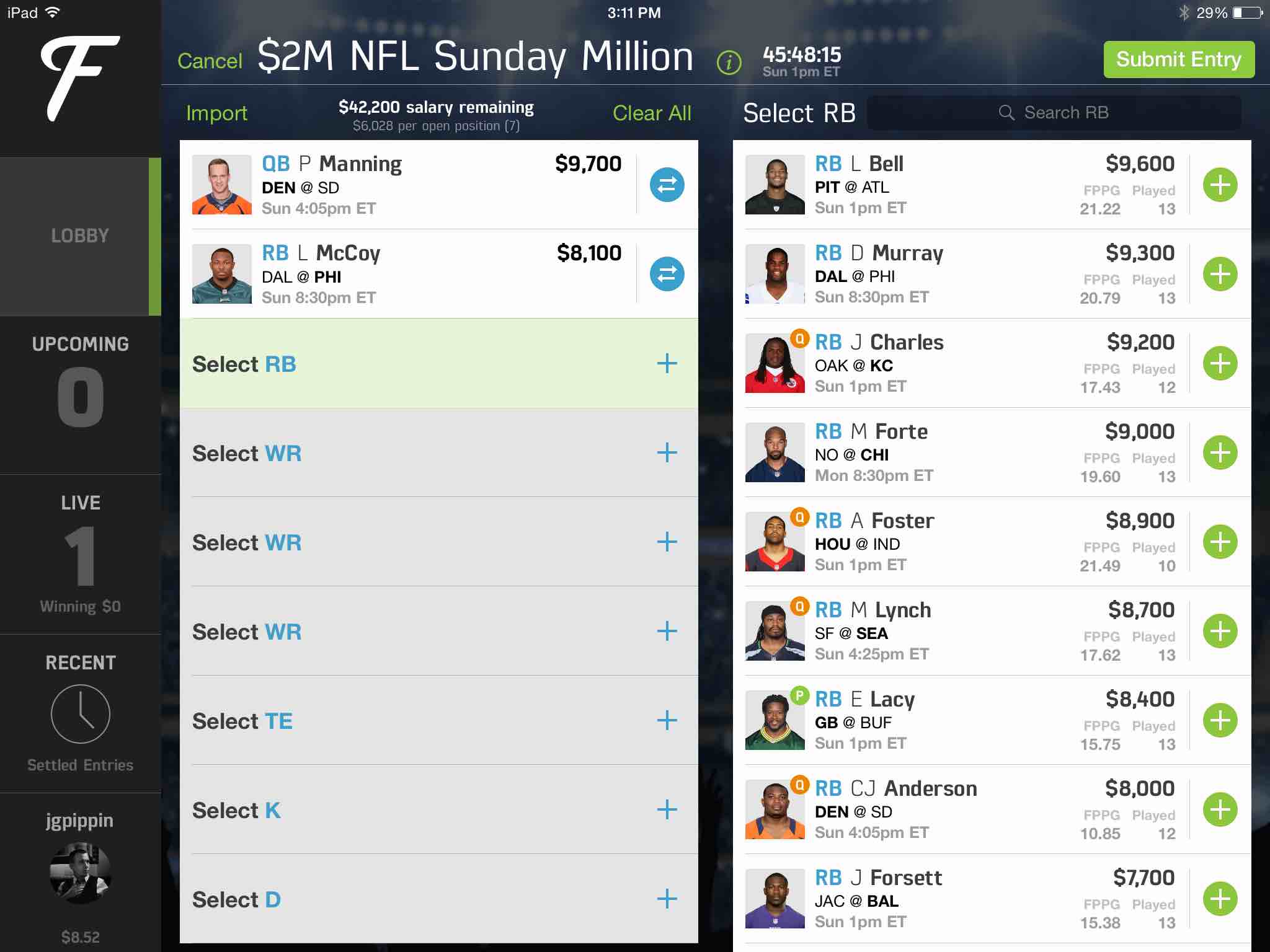
The post strives to give you some background on optimization. It starts with a simply toy example show you the math behind an optimization calculation. After that, this post tackles a more sophisticated optimization problem, trying to pick the best team for fantasy football. The FanDuel image below is a very common sort of game that is widely played (ask your inlaws). The optimization strategies in this post were shown to consistently win! Along the way, I will show a few code snippets and provide links to working code in R, Python, and Julia. And if you do win money, feel free to share it :)
Simple Optimization Example
A simple example, which I found online, starts with a carpenter making bookcases in two sizes, large and small. It takes 6 hours to make a large bookcase and 2 hours to make a small one. The profit on a large bookcase is $50, and the profit on a small bookcase is $20. The carpenter can spend only 24 hours per week making bookcases and must make at least 2 of each size per week. Your job as a data scientist is to help your carpenter maximize her revenue.
Your initial inclination could be that since the large bookcase is the most profitable, why not focus on them. In that case, you would profit (2*$20) + (3*$50) which is $190. That is a pretty good baseline, but not the best possible answer. It is time to get the algebra out and create equations that define the problem. First, we start with the constraints:
x>=2    ## large bookcases

y>=2    ## small bookcases

6x + 2y <= 24  (labor constraint)
Our objective function which we are trying to maximize is:
If we do the algebra by hand, we can convert out constraints to y <= 12 - 3x. Then we graph all the constraints and find the feasible area for the portion of making small and large bookcases:
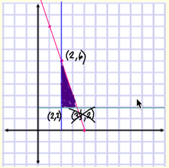
The next step is figuring out the optimal point. Using the corner-point principle of linear programming, the maximum and minimum values of the objective function each occur at one of the vertices of the feasible region. Looking here, the maximum values (2,6) is when we make 2 large bookcases and 6 small bookcases, which results in an income of $220.
This is a very simple toy problem, typically there are many more constraints and the objective functions can get complicated. There are lots of classic problems in optimization such as routing algorithms to find the best path, scheduling algorithms to optimize staffing, or trying to find the best way to allocate a group of people to set of tasks. As a data scientist, you need to dissect what you are trying to maximize and identify the constraints in the form of equations. Once you can do this, we can hand this over to a computer to solve. So lets next walk through a bit more complicated example.
Over the last few years, fantasy sports have increasingly grown in popularity. One game is to pick a set of football players to make the best possible team. Each football player has a price and there is a salary cap limit. The challenge is to optimize your team to produce the highest total points while staying within a salary cap limit. This type of optimization problem is known as the knapsack problem or an assignment problem.
Simple Linear Optimization
So for this problem, let’s start by loading a dataset and taking a look at the raw data. You need to know both the salary as well as the expected points. Most football fans spend a lot of time trying to predict how many points a player will score. If you want to build a model for predicting the expected performance of a player, take a look at Ben’s blog post.
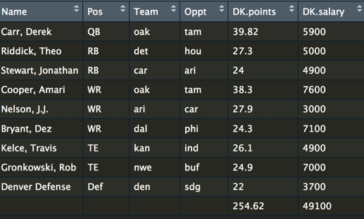
The goal here is to build the best possible team for a salary cap, let’s say $50,000. A team consists of a quarterback, running backs, wide receivers, tight ends, and a defense. We can use the lpSolve package in R to set up the problem. Here is a code snippet for setting up the constraints.
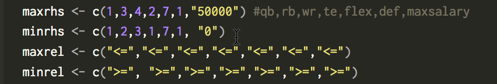
If you parse through this, you can see we have set a minimum and maximum for QB of 1 player. However, for the RB, we have allowed a maximum of 3 and a minimum of 2. This is not unusual in fantasy football, be because there is a role called a flex player, which anyone can choose and they can either be a RB, WR, or TE. Now let’s look at the code for the objective:
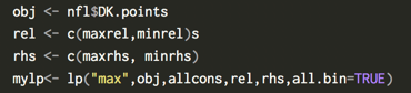
The code shows that we have set up the problem to maximize the objective of the most points and include our constraints. Once the code is run, it outputs an optimal team! I forked an existing repo and have made the R code and dataset are available here. A more sophisticated python optimization repo is also available.

Advanced steps
So far, we have built a very simple optimization to solve the problem. There are several other strategies to further improve the optimizer. First, the variance of our teams can be increased by using a strategy called stacking, where you make sure your QB and WR are on the same team. A simple optimization is a constraint for selecting a QB and WR from the same team. Another strategy is using an overlap constraint for selecting multiple lineups. An overlap constraint ensures a diversity of players and not the same set of players for each optimized team. This strategy is particularly effective when submitting multiple lineups. You can read more about these strategies here and run the code in Julia here. An code snippet of the stacking constraint (this is for a hockey optimization):
 .
.
Last year, at Sloan sports conference, Haugh and Sighal , presented a paper with additional optimization constraints. They include what an opponents team is likely to look like. After all, there are some players that are much more popular. Using this knowledge, you can predict the likely teams that will oppose your team. The approach here used Dirichlet regressions for modeling players. The result was a much-improved optimizer that was capable of consistently winning!
I hope this post has shown you how optimization strategies can help you find the best possible solution.
16 Jan 2018
Your boss hands you a pile of a 100,000 unlabeled images and asks you to categorize whether they are sandals, pants, boots, etc.
So now you have a massive set of unlabeled data and you need labels. What should you do?
This problem is commonplace. Lots of companies are swimming with data, whether its transactional, IoT sensors, security logs, images, voice, or more, and its all unlabeled. With so little labeled data, it is a tedious and slow process for data scientists to build machine learning models in most all enterprises.
Take Google’s street view data. Gebru had to figure out how to label cars in 50 million images with very little labeled data. Over at Facebook, they used algorithms to label half a million videos, a task that would have otherwise taken 16 years.
This post shows you how to label hundreds of thousands of images in an afternoon. You can use the same approach whether you are labeling images or labeling traditional tabular data (e.g, identifying cyber security atacks or potential part failures.)
The Manual Method
For most data scientists when asked to do something, the first step is to calculate who else should do this.

But 100,000 images could cost you at least $30,000 on Mechanical Turk or some other competitor. Your boss expects this done cheaply, since after all, they hired you because you use free software. Now, she doesn’t budget for anything other than your salary (if you don’t believe me, ask to go to pydata).
You take a deep breath and figure you can probably label 200 images in an hour. So that means in three weeks of non stop work, you can get this done!! Yikes!
Just Build a Model
The first idea is to label a handful of the images, train a machine learning algorithm, and then predict the remaining set of labels. For this exercise, I am using the Fashion-MNIST dataset (you could also make your own using quickdraw). There are ten classes of images to identify and here is a sample of what they look like:
I like this dataset, because each image is 28 by 28 pixels, which means it contains 784 unique features/variables. For a blog post this works great, but its also not like any datasets you see in the real world, which are often either much narrower (traditional tabluar business problem datasets) or much wider (real images are much bigger and include color).
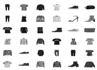
I built models using the most common data science algorithms: logistic regression, support vector machines (SVM), random forest and gradient boosted machines (GBM).
I evaluated the performance based on labeling 100, 200, 500, 1000, and 2000 images.
At this point in the post, if you are still with me, slow down and mull this graph over. There is a lot of good stuff here. Which algorithm does the best? (If you a data scientist, you shouldn’t fall for that question.) It really depends on the context.
You want something quick and dependable out of the box, you could go for the logistic regression. While the random forest starts way ahead, the SVM is coming on fast. If we had more labeled data the SVM would pass the random forest. And the GBM works great, but can take a bit of work to perform their best. The scores here are using out of the box implementations in R (e1071, randomForest, gbm, nnet).
If our benchmark is 80% accuracy for ten classes of images, we could get there by building a Random Forest model with 1000 images. But 1000 images is still a lot of data to label, 5 hours by my estimate. Lets think about ways we can improve.
Let’s Think About Data
After a little reflection, you remember what you often tell others — that data isn’t random, but has patterns. By taking advantage of these patterns we can get insight in our data.
Lets start with an autoencoder (AE). An autoencoder squeezes and compresses your data, kind of like turning soup into a bouillon cube. Autoencoders are the hipster’s Principle Component Analysis (PCA) , since they support nonlinear transformations.
Effectively this means we are taking our wide data (784 features/variables) reducing it down to 128 features. We then take this new compressed data and train our machine learning algorithm (SVM in this case). The graph below shows the difference in performance between an SVM fed with an autoencoder (AE_SVM) versus the SVM on the raw data.
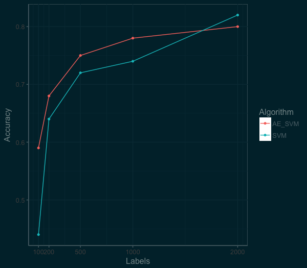
By squeezing the information down to 128 features, we were able to actually improve the performance of the SVM algorithm at the low end. At the 100 labels mark, accuracy went from 44% to 59%. At the 1000 labels mark, the autoencoder was still helping, we see an improvement from 74% to 78%. So we are on to something here. We just need think a bit more about the distribution and patterns in our data that we can take advantage of.
Thinking Deeper About Your Data
We know that our data are images and since 2012, the hammer for images is a convolutional neural network (CNN). There are a couple of ways we could use a CNN, from a pretrained network or as a simple model to pre-process the images. For this post, I am going to use a Convolutional Variational Autoencoder as a path towards the technique by Kingma for semi-supervised learning.
So lets build a Convolutional Variational Autoencoder (CVAE). The leap here is twofold. First, “variational” means the autoenconder compress the information down into a probability distribution. Second is the addition of using a convolutional neural networks as an encoder. This is a bit of deep learning, but the emphasis here is on how we are solving the problem, not the latest shiny toy.
For coding my CVAE, I used the example CVAE from the list of examples over at RStudio’s Keras page. Like the previous autoencoder, we design the latent space to reduce the data to 128 features. We then use this new data to train an SVM model. Below is a plot of the performance of the CVAE as compared to the SVM and RandomForest on the raw data.
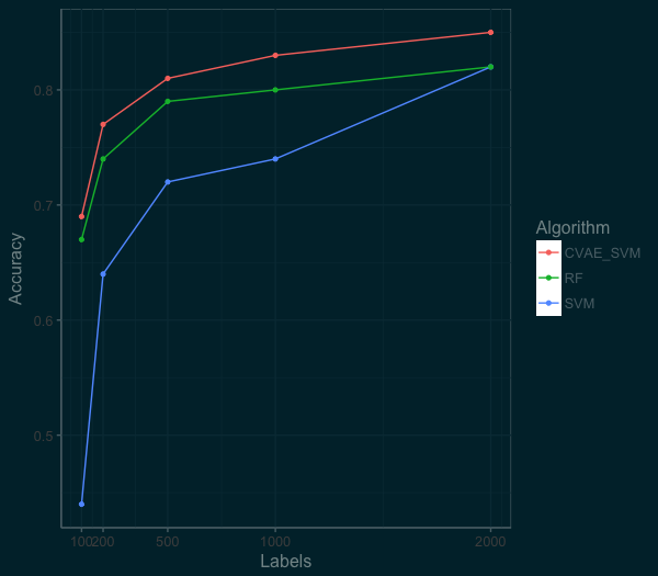
Wow! The new model is much more accurate. We can get well past 80% accuracy with just 500 labels. By using these techniques we get better performance and require less labelled images! At the top end, we can also do much better than the RandomForest or SVM model.
Next Steps
By using some very simple semi-supervised techniques with autoencoders, its possible to quickly and accurately label data. But the takeaway is not to use deep learning auto encoders! Instead, I hope you understand the methodology here of starting very simple and then trying gradually more complex solutions. Don’t fall for the latest shiny toy — pratical data science is not about using the latest approaches found in arxiv.
If this idea of semi-supervised learning inspires you, this post is the logistic regression of semi-supervised learning. If you want to dig further into Semi-Supervised Learning and Domain Adaptation, check out Brian Keng’s great walkthrough of using variational autoencoders (which goes beyond what we have done here) or the work of Curious AI, which has been advancing semi-supervised learning using deep learning and sharing their code. But at the very least, don’t reflexively think all your data has to be hand labeled.
Bio
Rajiv Shah is a data scientist at DataRobot, where he works with customers to make and implement predictions. Previously, Rajiv has been part of data science teams at Caterpillar and State Farm. He enjoys data science and spends time mentoring data scientists, speaking at events, and having fun with blog posts. He has a PhD from the University of Illinois at Urbana Champaign.
14 Jul 2017
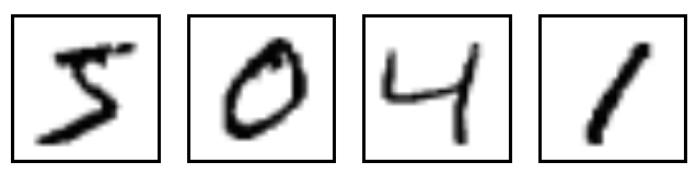
For those running deep learning models, MNIST is ubiquotuous. This dataset of handwritten digits serves many purposes from benchmarking numerous algorithms (its referenced in thousands of papers) and as a visualization, its even more prevelant than Napoleon’s 1812 March. The digits look like this:
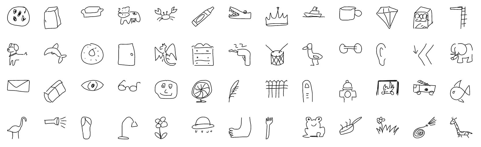
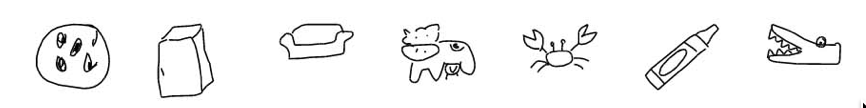
There are many reasons for its enduring use, but much of it is the lack of an alternative. In this post, I want to introduce an alternative, the Google QuickDraw dataset. The quickdraw dataset was captured in 2017 by Google’s drawing game, Quick, Draw!. The dataset consists of 50 million drawings across 345 categories. The drawings look like this:
Build your own Quickdraw dataset
I want to walk through how you can use this drawings and create your own MNIST like dataset. Google has made available 28x28 grayscale bitmap files of each drawing. These can serve as drop in replacements for the MNIST 28x28 grayscale bitmap images.
As a starting point, Google has graciously made the dataset publicly available with documentation on the dataset. All the data is sitting in Google’s Cloud Console, but for the images, you want this link of the numpy_bitmaps.
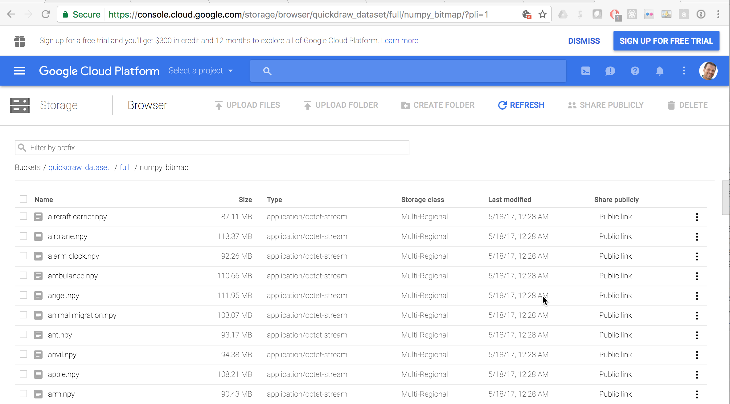
You should arrive on a page that allows you to download all the images for any category. So this is when you have fun! Go ahead and pick your own categories. I started with eyeglasses, face, pencil, and television. As I learned from the face, the drawings that have fine points can be more difficult to learn. But you should play around and pick fun categories.
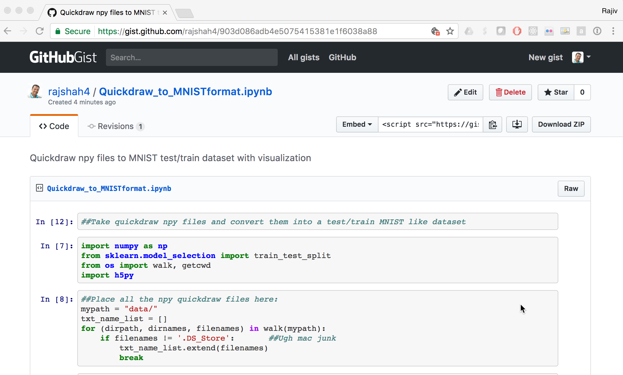
The next challenge is taking these .npy files and using them. Here is a short python gist that I used to read the .npy files and combine them to create a 80,000 images dataset that I could use in place of MNIST. They are saved in a hdf5 format that is cross platform and often used in deep learning.
Using Quickdraw instead of MNIST
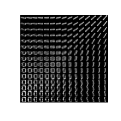
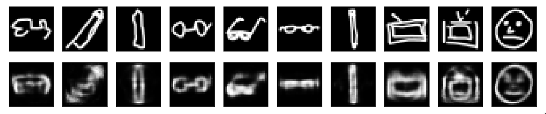
The next thing is to go have fun with it. I used this dataset in place of MNIST for some work playing around with autoencoders in Python from the Keras tutorials. The below picture represents the original images at the top and reconstructed ones at the bottom, using an autoencoder.
I next used this dataset with a variational autoencoder in R. Here is the code snippet to import the data:
library(rhdf5)
x_test <- t(h5read("x_test.h5", "name-of-dataset"))
x_train <- t(h5read("x_train.h5", "name-of-dataset"))
y_test <- (h5read("y_test.h5", "name-of-dataset"))
y_train <- (h5read("y_train.h5", "name-of-dataset"))
Here is a visualization of its latent space using my custom quickdraw dataset. For me, this was a nice fresh alternative to always staring at the MNIST dataset. So next time you see MNIST listed . . . go build your own!